Ecommerce Email Redesign
This project was intended to re-imagine our standard ecommerce emails through user research, testing, and design.
By identifying pain points and opportunities in our existing templates and touch points, I designed a cohesive and flexible modular template system that improves the general value of our emails and allows more flexibility for our clients to customise them to match their own brand.
UI.UX
Conor Casey
Role:
Design, Research
Date:
2024

Project Overview
As a DTC ecommerce company, we provide our clients and retailers with a suite of transactional, tracking, and support emails as part of our core offering but these had not been updated for a number of years.
The existing templates were severely limited - locked down with minimal customization options, restricted to basic colors and web-safe fonts, and containing only a few editable text fields. Their look and layout had never been optimized for user experience, creating friction at critical customer touch-points, this presented us with plenty of opportunity for improvement.
The lack of flexibility had also been raised as a pain point with a number of our clients on early workshops, larger brands needed to more control over the templates, more opportunity for marketing/click-back and wanted their branding play a larger part of the email.
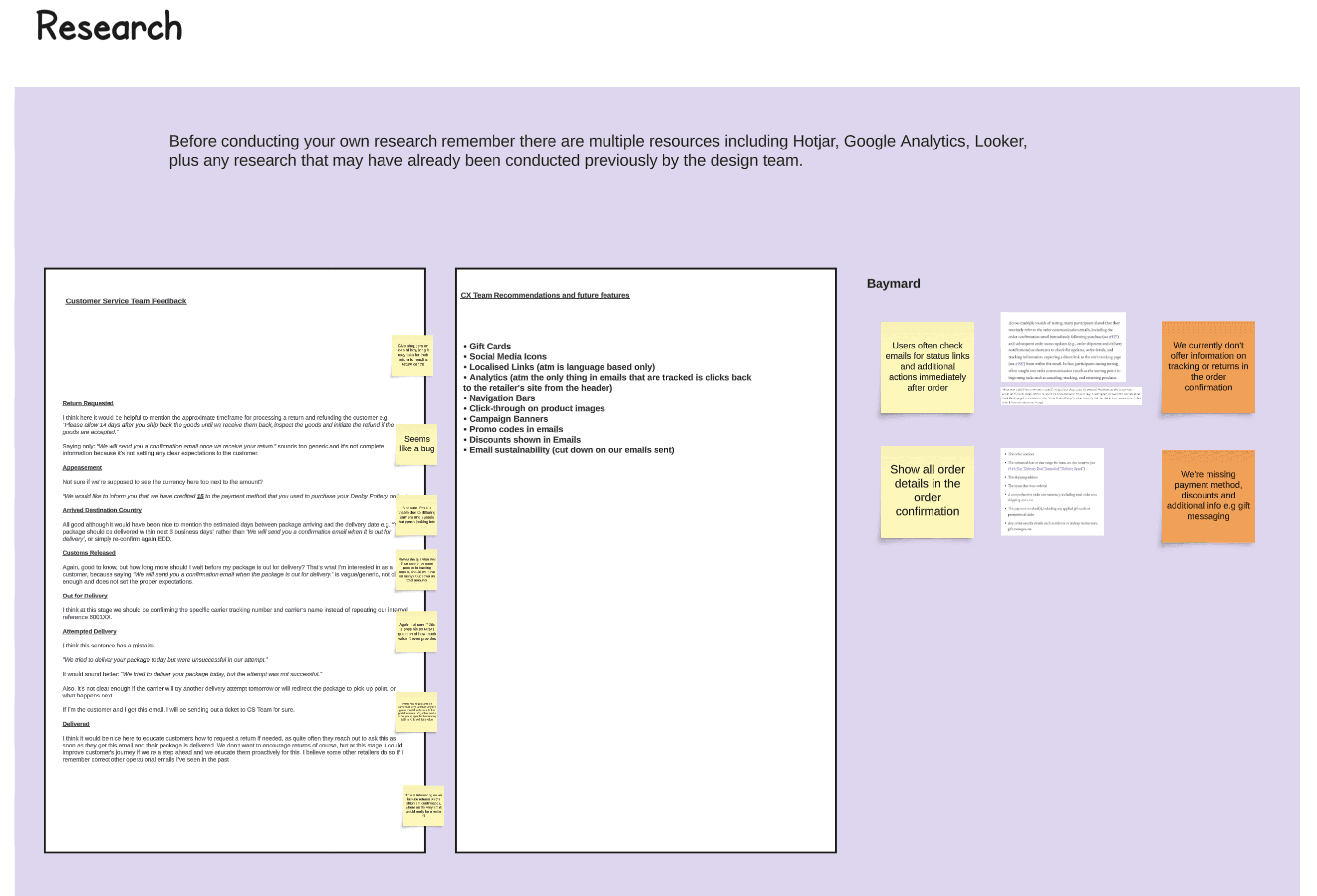
Discovery & Research
I initiated the project by conducting comprehensive discovery research:
Drafted a Problem Statement with benefit hypothesis and expected outcomes to guide our internal strategy.
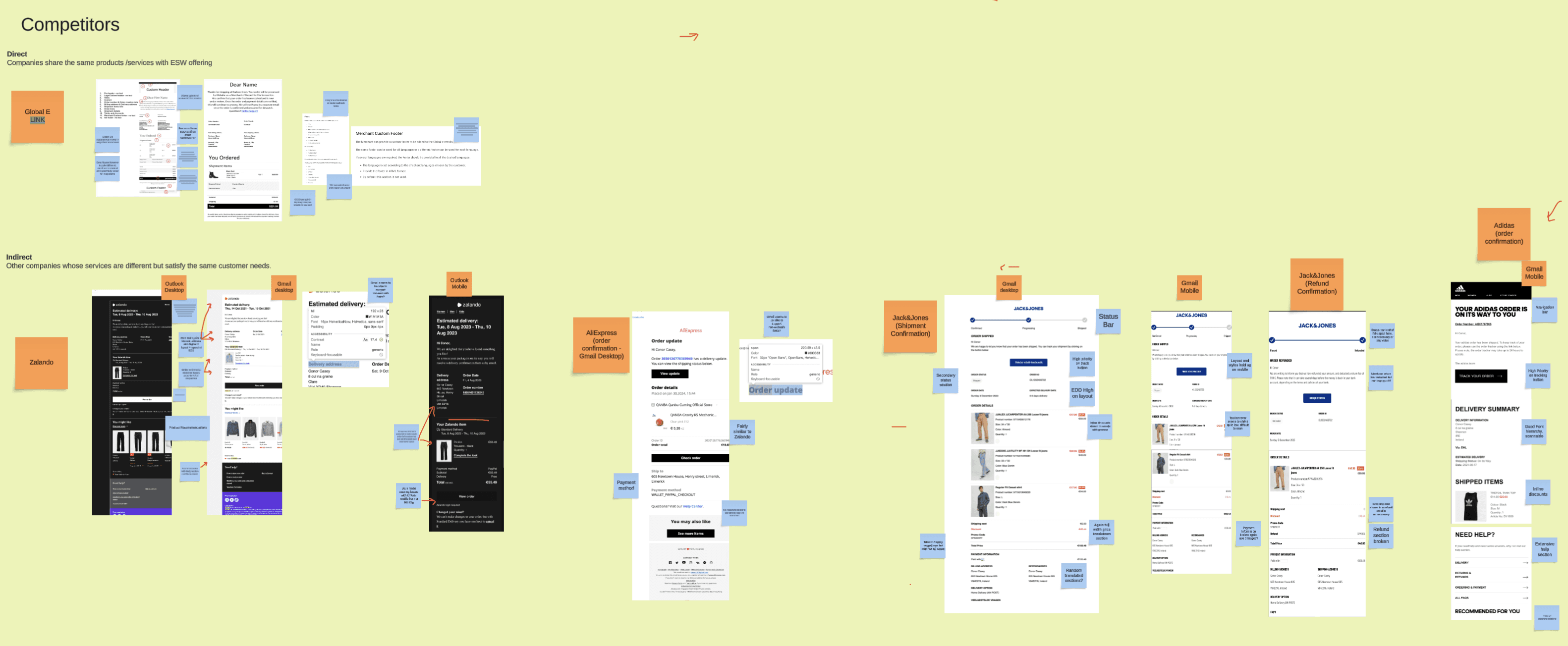
Performed Competitive Analysis by examining our offering against competitors and potential client needs.
Conducted desk research using Baymard Institute best practices and consulted Customer Experience teams to minimize support contacts.
Facilitated a Prioritisation Mapping workshop with Product and Tech stakeholders to strategically plan project next steps, balancing priority against required effort.
The research aimed to systematically understand and address our email design challenges.


Initial Design & Testing
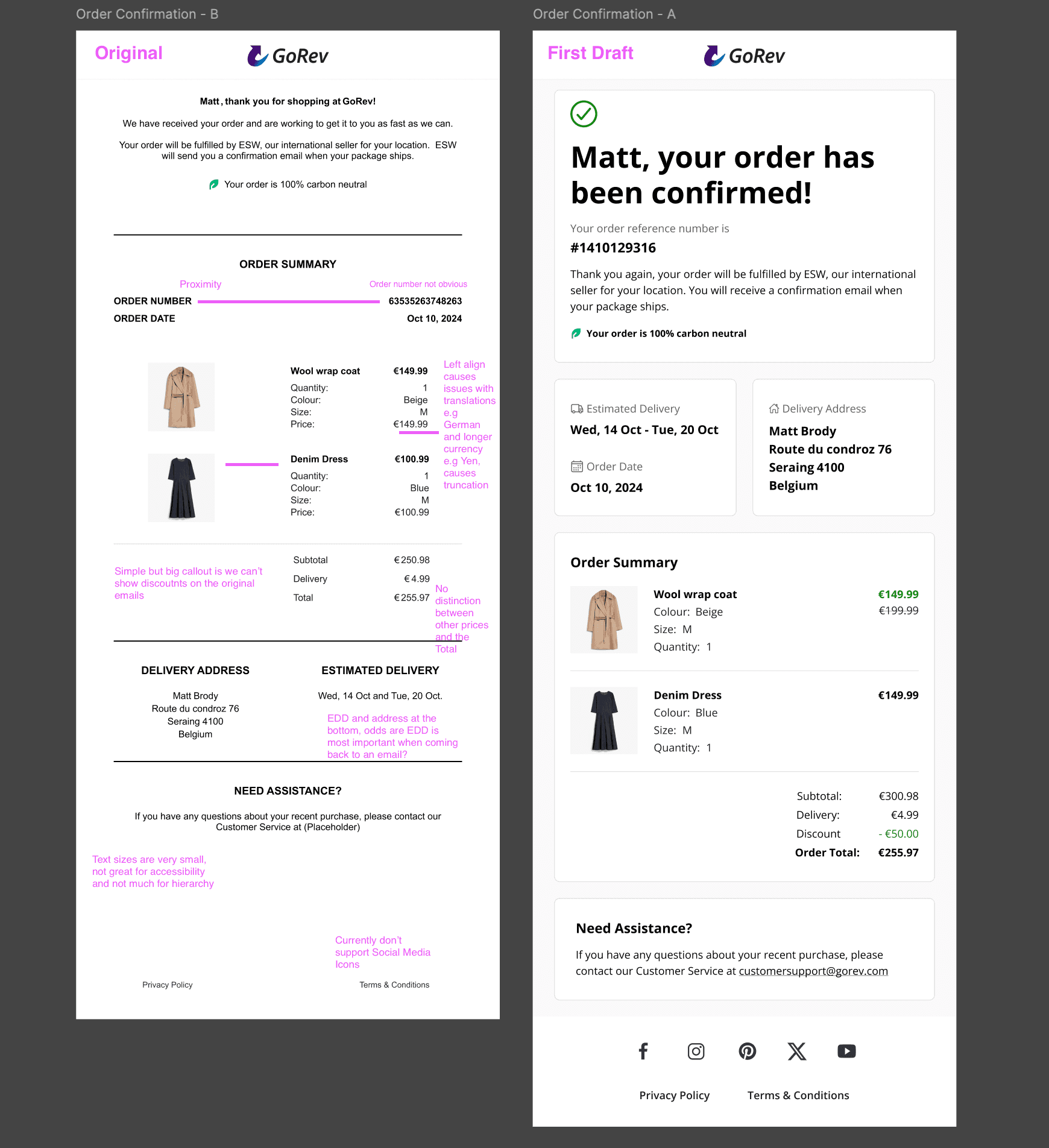
Testing
I tested these with a panel of 20 UK participants via Maze, asking general questions on shopper interactions with emails and some quick fire tests to see if users could identify key info with only 5 seconds of the design shown.
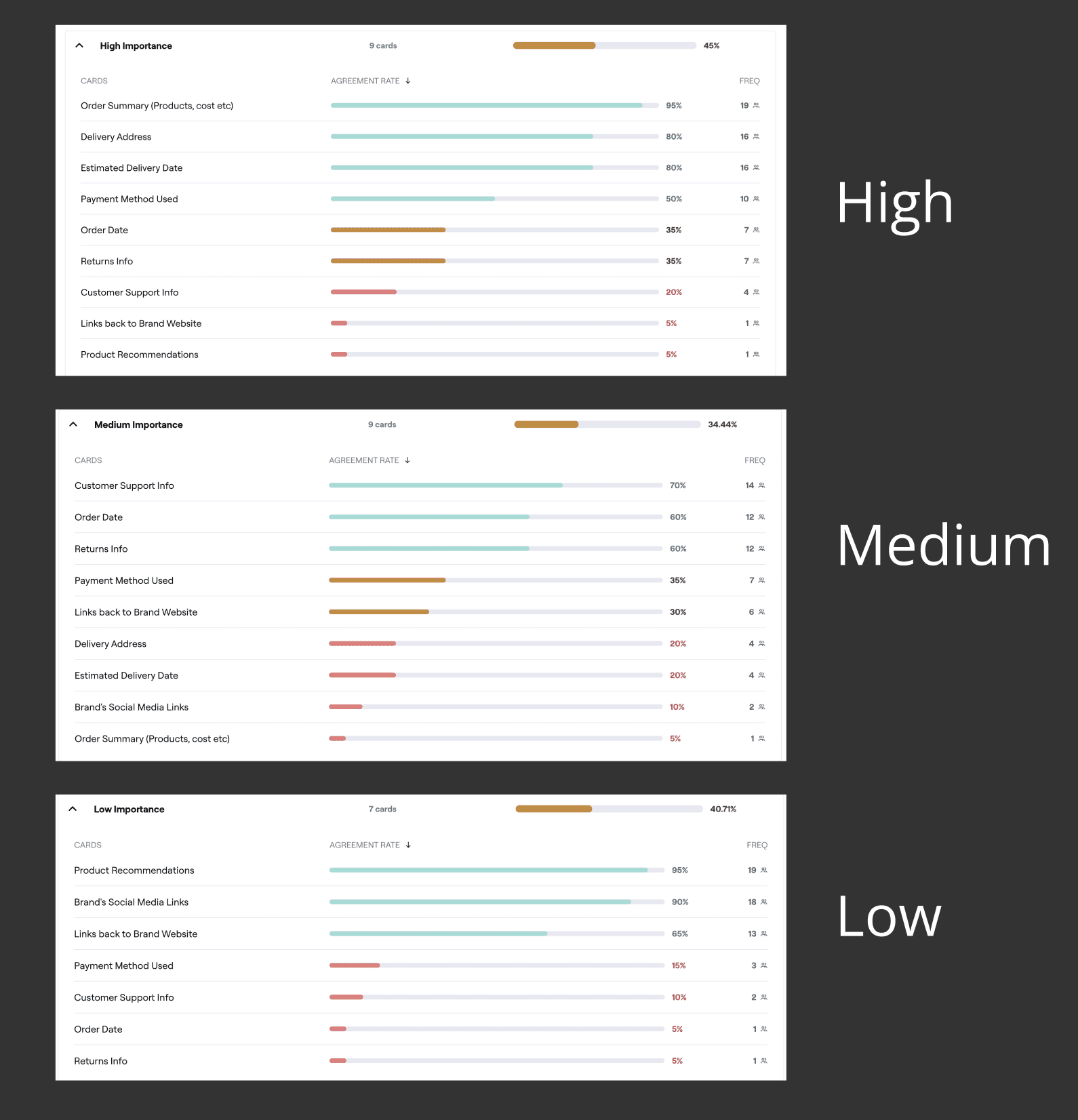
I also included a card-sorting exercise to get an idea of how important shoppers see specific pieces of information so that I could inform the layout of the email and optimise based on what they want to see, when.
Even during this initial test, 85% of users stated they preferred the new visuals and layout to the original, with the remaining 15 preferring different info be presented at the top of the email, also being shown in the card sort.
Client Requests
In the next design iteration, I aimed to incorporate client feedback from workshops I've run. Beyond standard improvements like Google Fonts support and full dark mode, I proposed a modular email design approach.
By transforming each content section into a configurable panel/component, retailers could:
Easily toggle content on/off
Reorganize email layouts
Add marketing materials without developer intervention
This modular system would allow self-service customization through our portal, giving retailers unprecedented flexibility in email design while maintaining a consistent template structure.
The concept involves drag-and-drop functionality for adding components like image banners and product recommendations, fundamentally reimagining our email template approach.

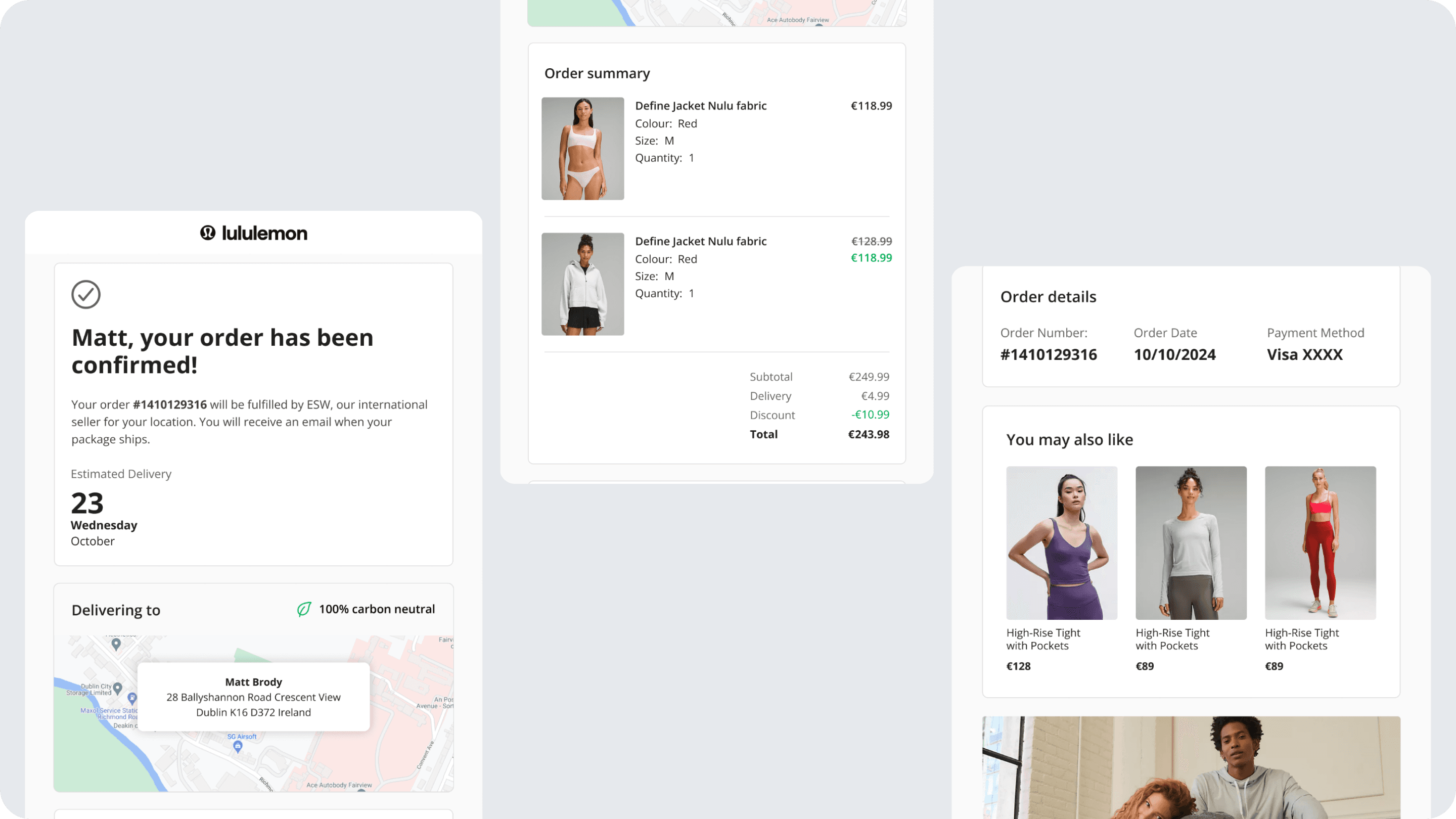
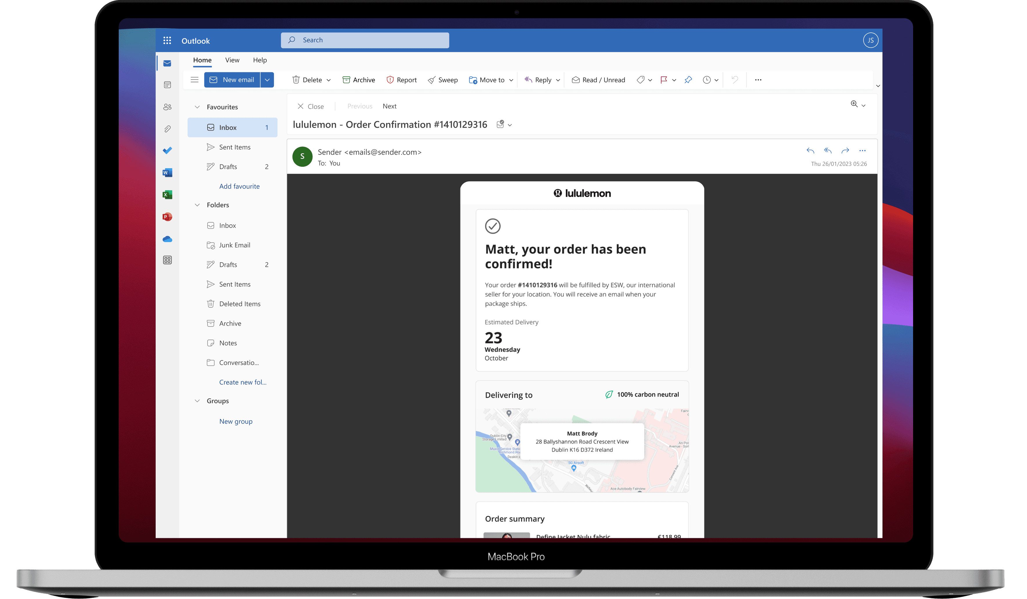
Final Design & Testing
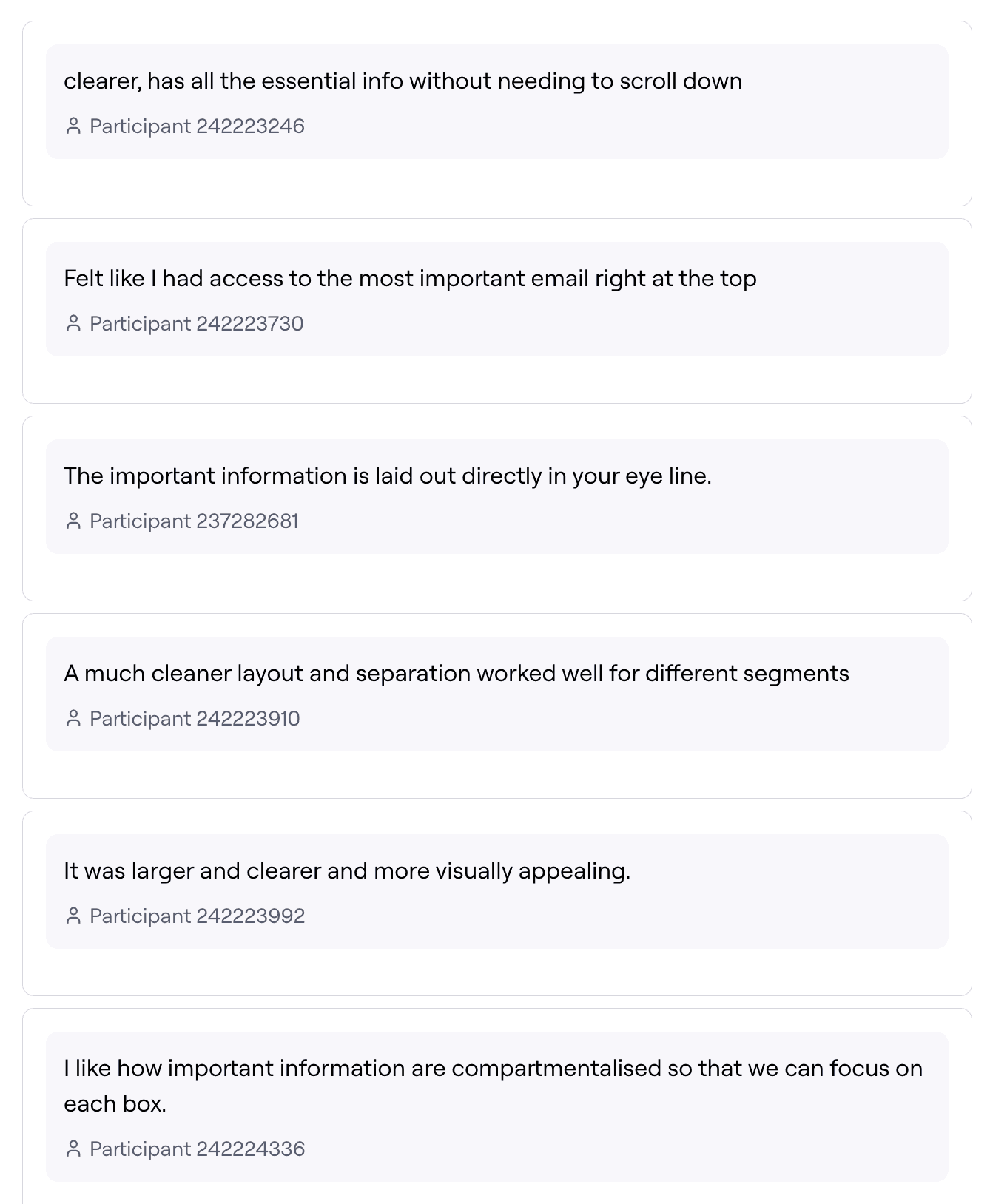
Using findings from testing the initial wireframes and the new retailer focused features being brought in, I settled on a final set of designs and again tested this in Maze with a larger panel of 30 UK shoppers. The results were even better with a lot of very positive feedback when compared against the original designs.
I'll leave some snippets of said feedback to the right of this section, and below I'll include some visuals I used when presenting the designs internally, flagging the most important changes and updates.